How to use the Elevation Profile
The elevation profile is interactive and shows you stats about points along your route, including gradients, with highlighting for steep avalanche terrain. You can use some tools adjust the profile to improve its statistics for your route.
Interactive Statistics
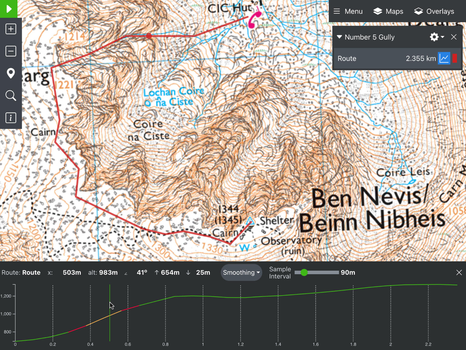
You can move your mouse along the elevation profile to get stats about that point in your route. As an example, here's a screenshot of a route up Number 5 gully on Ben Nevis. You can view the actual route here.

In the screenshot, the mouse is hovering about 0.5km into the route, in the steep bit of Number 5 Gully. There is a corresponding red dot on the route itself. This lets you match up points along the elevation profile with the actual point on the map itself. At this point, the statistics are:
- x: 503m - You are looking at a point 503m into your route
- alt: 983m - This point is 983m above sea level.
- ∠ 41o - The slope gradient, sampled around this point, is 41 degrees.
You can also click the mouse to centre the map on the corresponding point.
Gradient Highlighting for Avalanches
In Staying Alive in Avalanche Terrain , Bruce Temper says the most dangerous slopes are those inclined between 30o to 40o. Slopes steeper than 40o are still dangerous, but marginally less so. Slopes below 30o are less dangerous (but should still be considered for avalanche danger).
Accordingly, the elevation profile is highlighted to show these gradients:
- 30o or less
- 30o to 40o
- 40o or more
Overall Statistics
There are some more stats shown in the screenshot above that relate to the overall route:
- ↑ 654m - the total ascent along this route is 654m
- ↓ 25m - the total descent along this route is 25m
Smoothing
Imagine you are trying to draw a route down a river, like this canoe trip from Grantown on Spey to Craigellachie. The default elevation profile looks like this:

It is not the smooth downhill line that you would expect. What's more, the stats report an ascent and a descent of 274m/390m. But the true figure is more like 0m/120m. This inaccuracy arises because elevation data is available as a grid, where the resolution of the grid is:
| Coverage Area | Resolution (in meters) |
|---|---|
| Global (including poles) | 900 m |
| Global 56° S - 60° N | 90 m |
| United States | 10 m |
These problems then arise:
- This grid does not line up perfectly with your route. So a spot height sampled along the route is interpolated from the nearest grid points.
- The map might not be perfect, eg a footpath can be drawn in the wrong place
- Your route will not be drawn perfectly
Note - these problems affect all route planning websites.
This is particularly noticeable on the Spey. The elevation data will be sampled from points just either side of the river itself, which might be quite high up a river cliff, giving misleading results.
The smoothing function tries to deal with this by discarding anomalous points. If the route is generally downhill, a blip upwards is discarded as an inaccuracy.
Smoothing can be set to None, Mild or Agressive. For the River Spey trip, these settings result in:
- None - Total climb is 274m, descent is 390m
- Mild - Total climb is 105m, descent is 230m
- Aggressive - Total climb is 89m, descent is 188m
So by applying smoothing the statistics are better, but still not perfect. You can continue to improve this by altering the sample interval. This is described in the next section.
Note - changing the smoothing only affects the statistics. It does not redraw the profile.
Sample Interval
To draw the profile, a route is sampled at intervals of 90m by default. For each of these points, an elevation is computed from the data grid. The problems here are:
- The chosen sample points might not match the grid and the elevation result will have been interpolated
- In steep terrain, particularly around a summit, the sample points might be just before and just after an abrupt change in gradient, like the summit itself.
To work around this, you can change the sample interval. Short routes in mountains (like Number 5 Gully above) tend to benefit from a smaller sample interval. Longer routes in flatter terrain can benefit from a bigger sample interval.
For the Spey, with mild smoothing and a sample interval of 250m, the stats become ascent/descent of 25m/116m. This is much closer to the likely true figure of 0m/120m.
Using Smoothing and Sample Interval Together
There is no ideal combination of smoothing and sample interval and no clear strategy for how best to apply them. The trick lies in altering both to get a feel for the route's profile. This is particularly true if planning around avalanche terrain and you see a steep gradient, or if you don't see a steep gradient where you expected one. Adjust the sample interval up and down and see how the slopes change. Use the cursor to check the steep slope matches up to the contours on the map. Tweak the route itself, to try sampling just to one side or another. By combining all these approaches, you can gather more data about the slope characteristics.